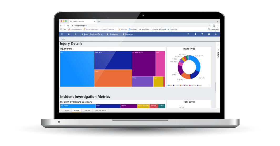
Clear and meaningful visualisation is the key to seeing and understanding trends and patterns in data.
Make effective data-driven decisions
When the right data is visualised effectively, it can tell a very meaningful story. We can learn if something is going well or may need attention, and we can then make an informed data-driven decision and act accordingly.
Our software makes analytics accessible with interactive dashboards built using MS Power BI and sophisticated reporting capabilities. Power BI License holders can also build custom widgets & dashboards including integrating custom fields.
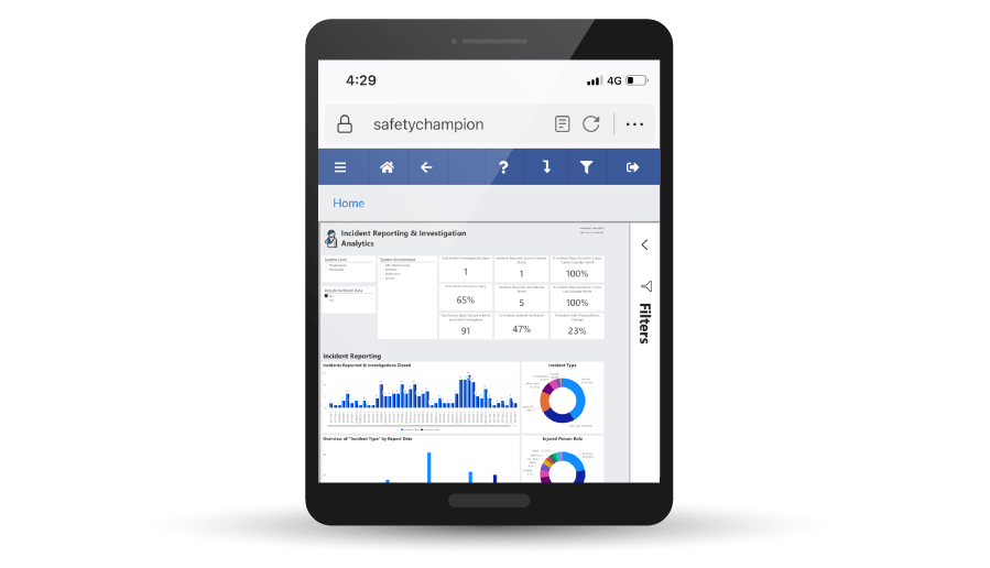
Users can deep dive into areas like injury reporting where you can review trends in employee age and gender, and detail of the injuries. You can even explore how your workforce is interacting with the system – identify user behaviour, who is using the system and when, and even drill down to what device they’re using!
Exploring your data with Safety Champion’s intuitive visual analytics is the best way to make informed decisions on safety trends and performance.

After pricing?
Jot down your details and we’ll get back to you shortly!
SEE OUR RECENT BLOGS
Top health and safety tech trends in the manufacturing & industrial sector
Dive deeper into your data with our Data Analytics Software. Visualise your desired insights and detect future trends that will […]
Read More ›How safety management software can help you to manage COVID-19 risks in the workplace
Dive deeper into your data with our Data Analytics Software. Visualise your desired insights and detect future trends that will […]
Read More ›Tracking Your Impact
Dive deeper into your data with our Data Analytics Software. Visualise your desired insights and detect future trends that will […]
Read More ›

